-
Client
Fika Coffee & Chocolates - Mount Eliza
Project Outline
Logo | Brand | Print | Signage | Promotional
-
The Project
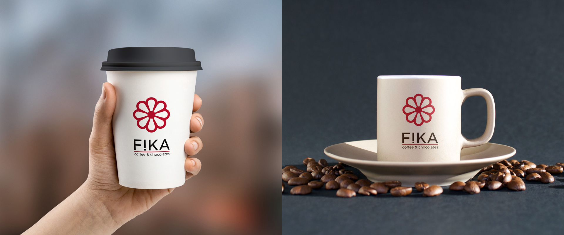
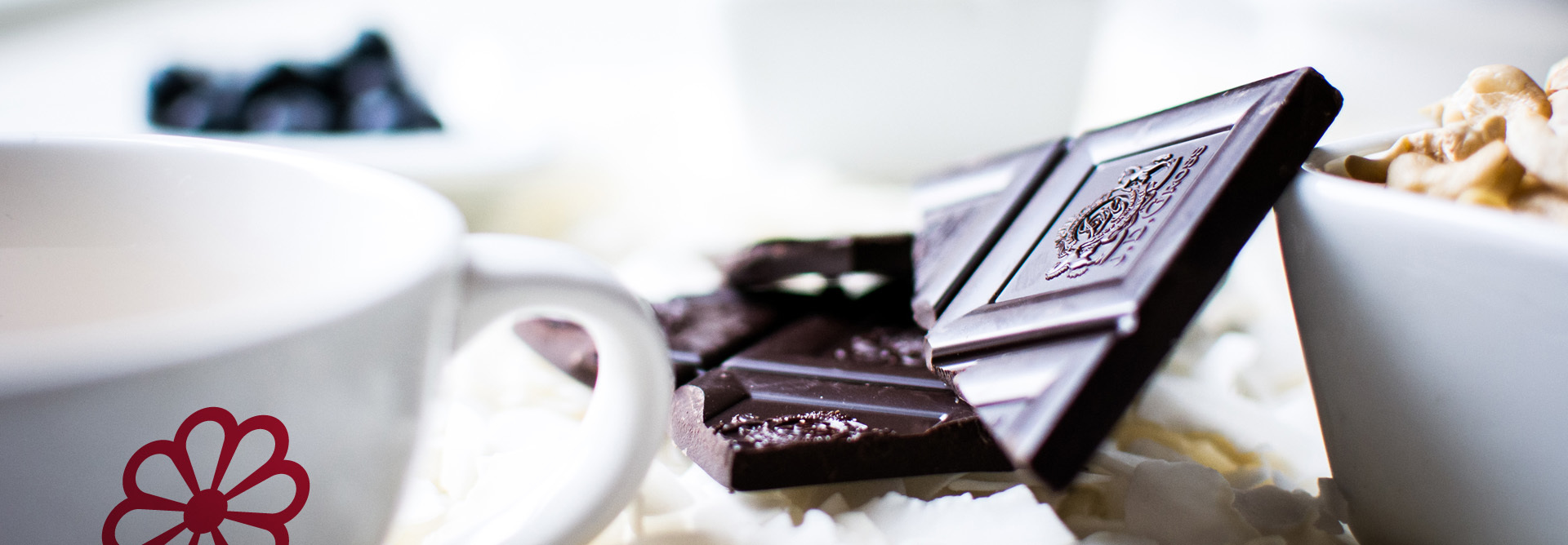
FIKA -(pronounced fee-ka) is a Swedish custom, a kind of social coffee break where people gather to have a cup of coffee or tea and a few nibbles. Fika is such an important part of life in Sweden that it is both a verb and a noun.
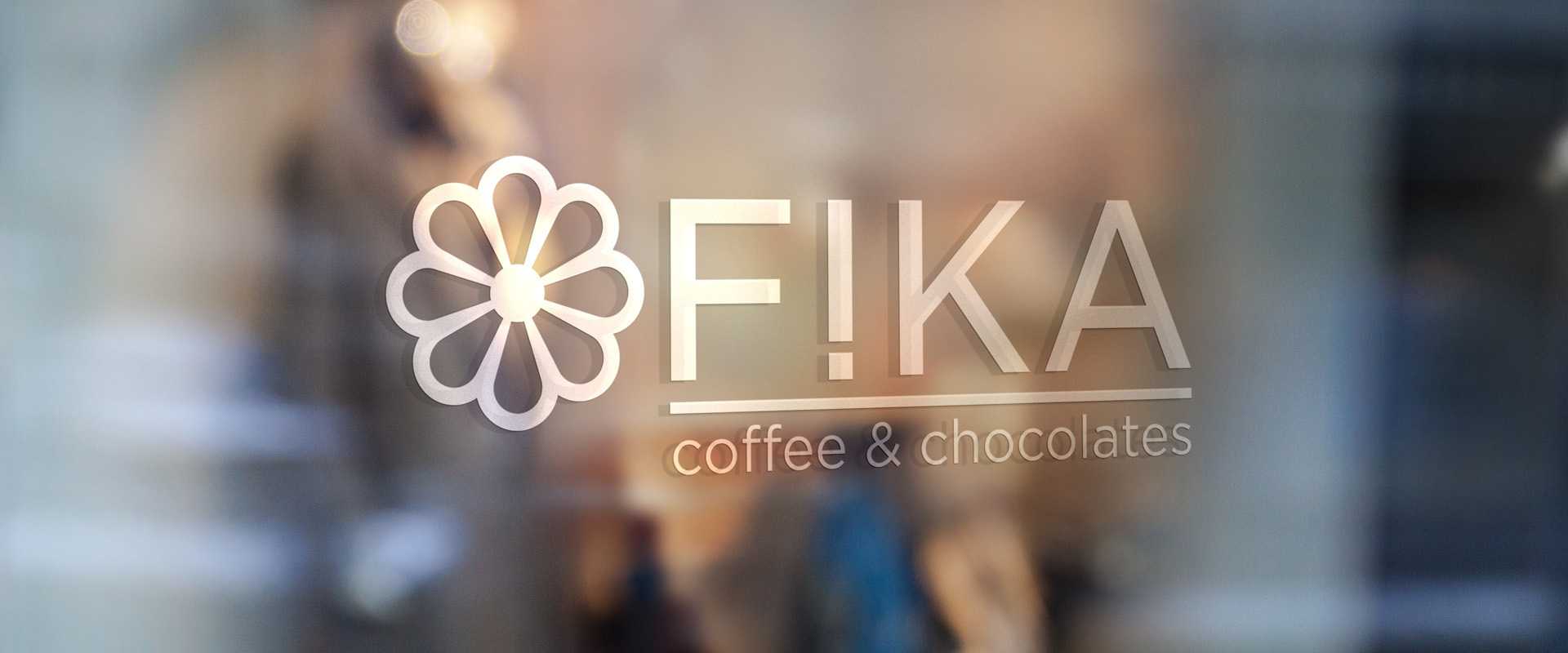
Being a Swedish named business, Aurora Creative approached developing the logo design and brand would use Swedish design principles. Clean, simplified, geometric.
The logo needed to represent what Fika means, the coming together of people for Coffee and a bite to eat. The icon for FIKA symbolises a traditional Swedish pastry and is used as a stamp throughout the branding identity elements. The upside down I is used as a exclamation mark. 'Let's FIKA now'. The meaning is then enhanced by adding the red underline.
Aurora Creative has produced a clean, professional image across a suite of branded business cards, stickers, aprons and building signage.